The Planning Enforcement Advisory
Planning enforcement consultancy
StrategyBrand identityUX/UIDevelopment2026
The Planning Enforcement Advisory, animated identity mark
A new specialist planning enforcement consultancy needed a brand, positioning and digital experience that could turn genuine expertise into something people could quickly understand and trust, without an existing reputation to lean on.
01
Understand
The brief
A new business with real expertise, but no established reputation to lean on.
New business
No existing brand recognition, reviews or reputation.
Strong expertise
The founder had worked council side, investigating the same kinds of planning enforcement cases the consultancy would now advise on.
Broad audience
Homeowners, landowners and businesses, many with little prior understanding of planning enforcement.
Brand problem
An earlier A.P.E. direction introduced an animal association that risked making a serious advisory service feel gimmicky or aggressive.
Trust had to come from the founder’s expertise, useful information and a professional identity.
Research
I looked at the market, what people were searching for, and what information they needed before choosing professional help.
- Planning enforcement competitors
- Wider planning consultancies
- Government planning guidance
- Search intent around notices and breaches
- Consumer research from legal services
- How complex public information is explained
01
People want information before making contact.
85% of consumers in the SRA’s research on legal services wanted more information before choosing a provider.1
So I made the site useful before asking anyone to enquire.
02
Professional processes are not always easy to understand.
SRA research found that legal and professional processes are not always clearly explained to the people using them.2
So the site uses plain English and makes the next step clear.
03
Some deadlines are genuinely urgent.
GOV.UK guidance sets a statutory 21-day window for responding to a Planning Contravention Notice.3
So deadlines are shown clearly instead of manufacturing urgency through marketing.
Sources+
- 01Solicitors Regulation Authority, Better information in the legal services market (link pending)
- 02Solicitors Regulation Authority, consumer research on legal services (link pending)
- 03GOV.UK, Enforcement and post permission matters (link pending)
People did not need to understand planning enforcement. They needed to recognise their situation and know what to do next.
RecognitionUnderstandingAction
02
Define
Specialist planning enforcement advice built around genuine former council-side experience.
That expertise needed to make sense to someone who might know almost nothing about planning enforcement. So the direction came down to a few concrete decisions:
- Position the business as a specialist, not a generalist agency
- Lead with genuine former council-side experience
- Organise the site around situations people recognise, not service names
- Use plain English throughout
- Surface real deadlines clearly
- Make contacting a real person straightforward
- Build a distinctive identity without making the subject feel playful
- Avoid looking indistinguishable from a traditional law firm
Because whoever landed on the site needed to answer three questions quickly:
Do you understand my situation?
Can I trust you?
What should I do next?
03
Create
Structure
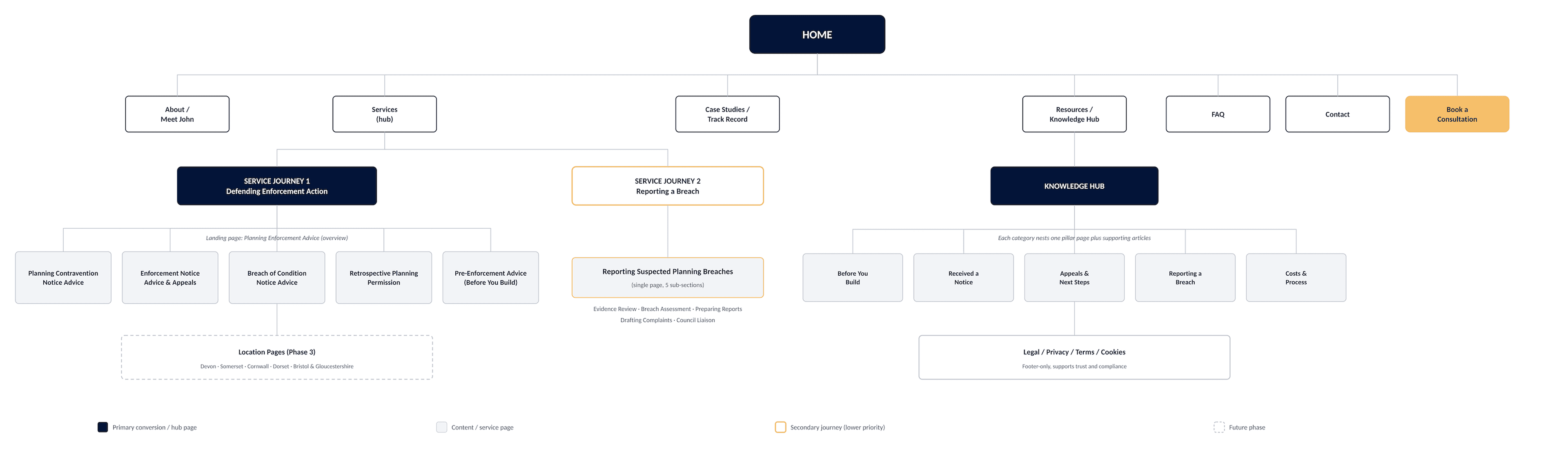
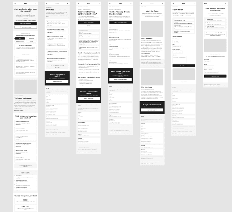
I mapped the navigation and key journeys before styling anything. The research showed people would often recognise their situation before they knew which professional service they needed, so the navigation had to solve that problem first.
Three directions
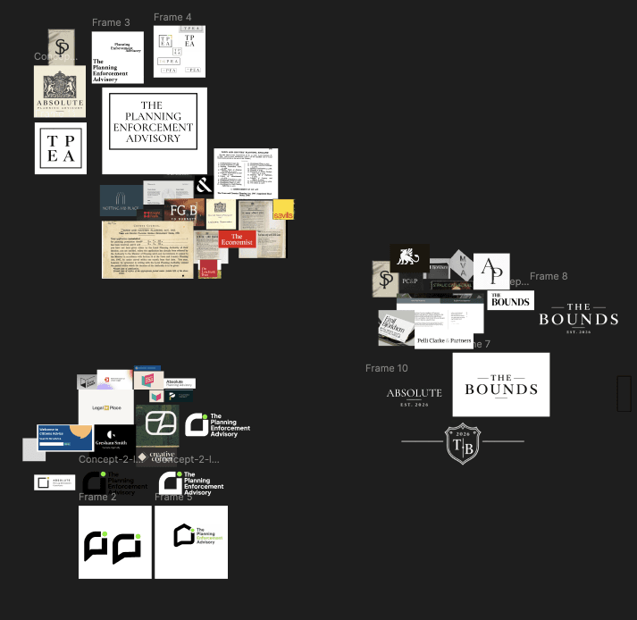
For influences I looked at professional services, legal brands, planning consultancies, editorial design, government and civic communication, and geometric identity systems. The goal was not to copy any of them, but to see how they balanced credibility, clarity, distinctiveness and accessibility.
From there I explored three substantially different directions, each testing a different balance between traditional professional authority and a more distinctive, approachable identity.
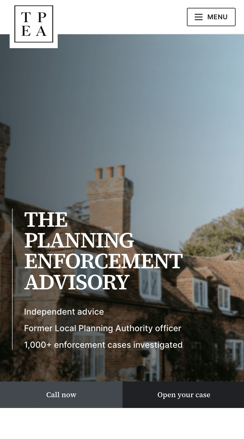
Rather than show three logos, I built each direction into a full landing page. This let the client judge typography, colour, hierarchy and tone in context, not in isolation.
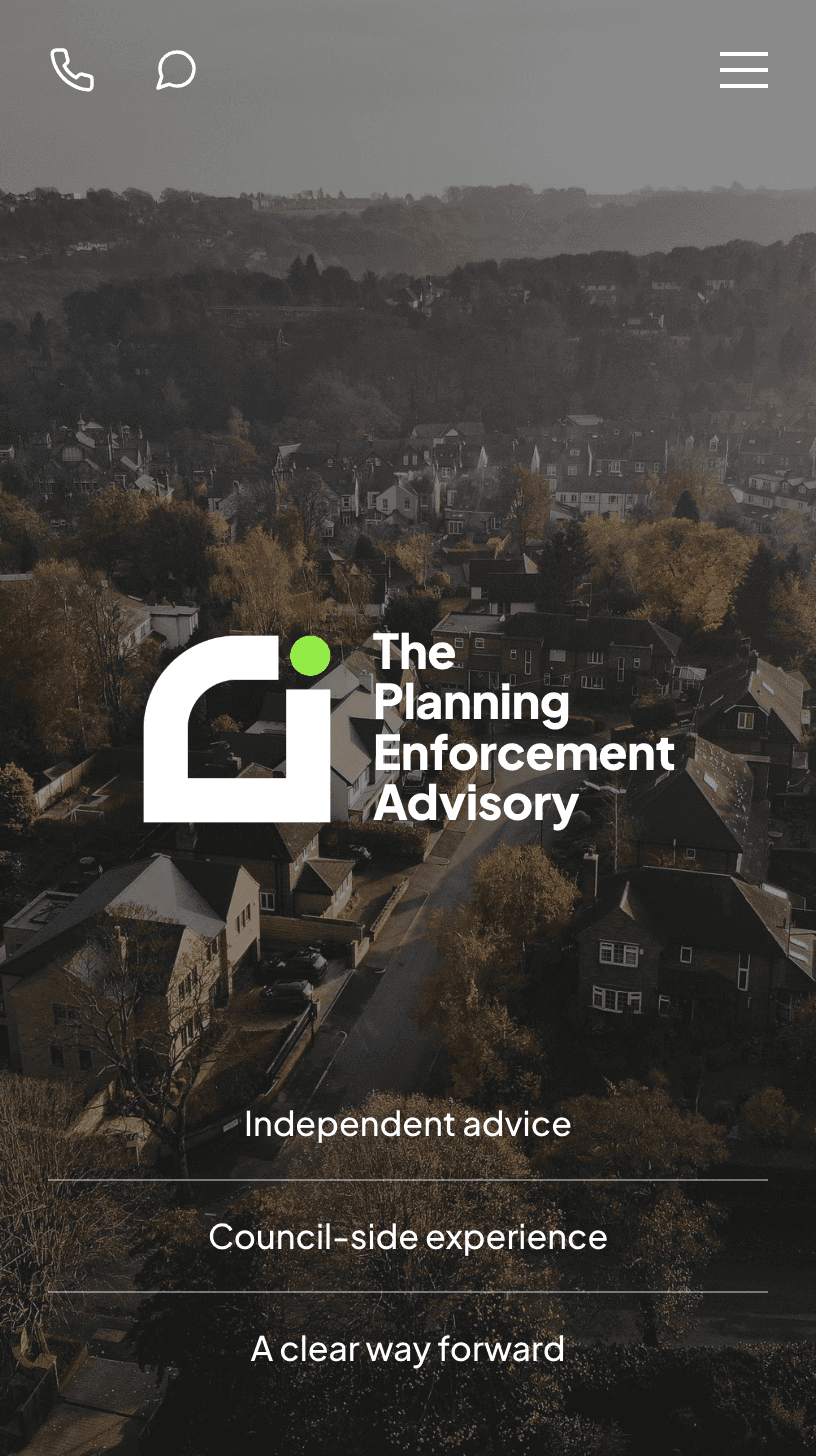
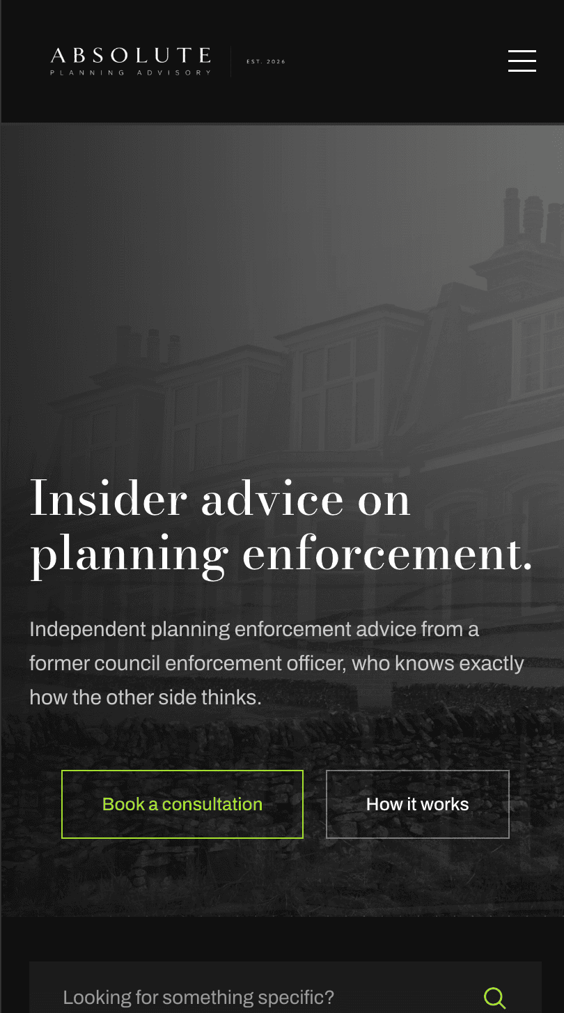
01
A brighter, more distinctive lime-led identity.
02
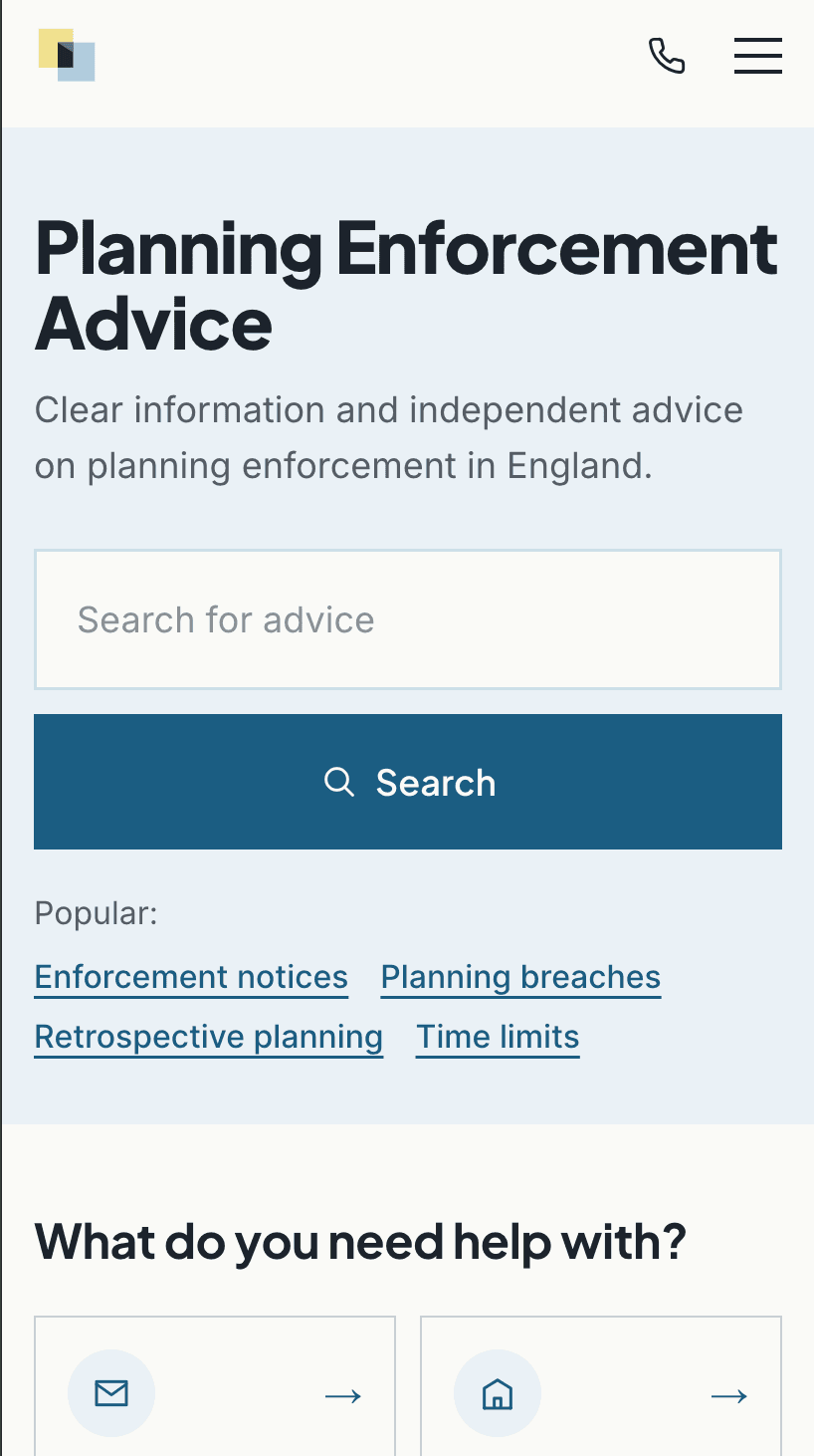
A calmer, more structured professional direction.
03
A more traditional institutional direction. Credible, but too distant for the service.
The client chose direction two.
I asked what specifically was working for him rather than treating the whole concept as finished. His feedback became the starting point for the next round of refinement.
Refinement
The chosen direction needed to feel professional and distinctive, but planning enforcement pages carry a lot of unfamiliar information. It would have been easy to make the design look impressive and harder to actually use.
So as the direction developed, I looked more closely at GOV.UK and Citizens Advice. Not for their visual style, but for how they make complicated information easier to navigate. The challenge became keeping enough detail to be genuinely useful without the site feeling dense or bureaucratic.
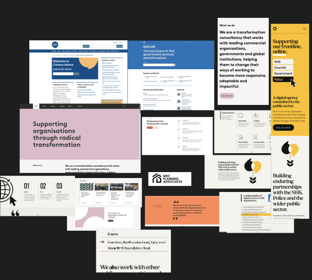
In practice that meant a clearer hierarchy, more direct headings, shorter explanations and a more obvious next step on every page, with colour used more sparingly around serious guidance rather than decoratively.
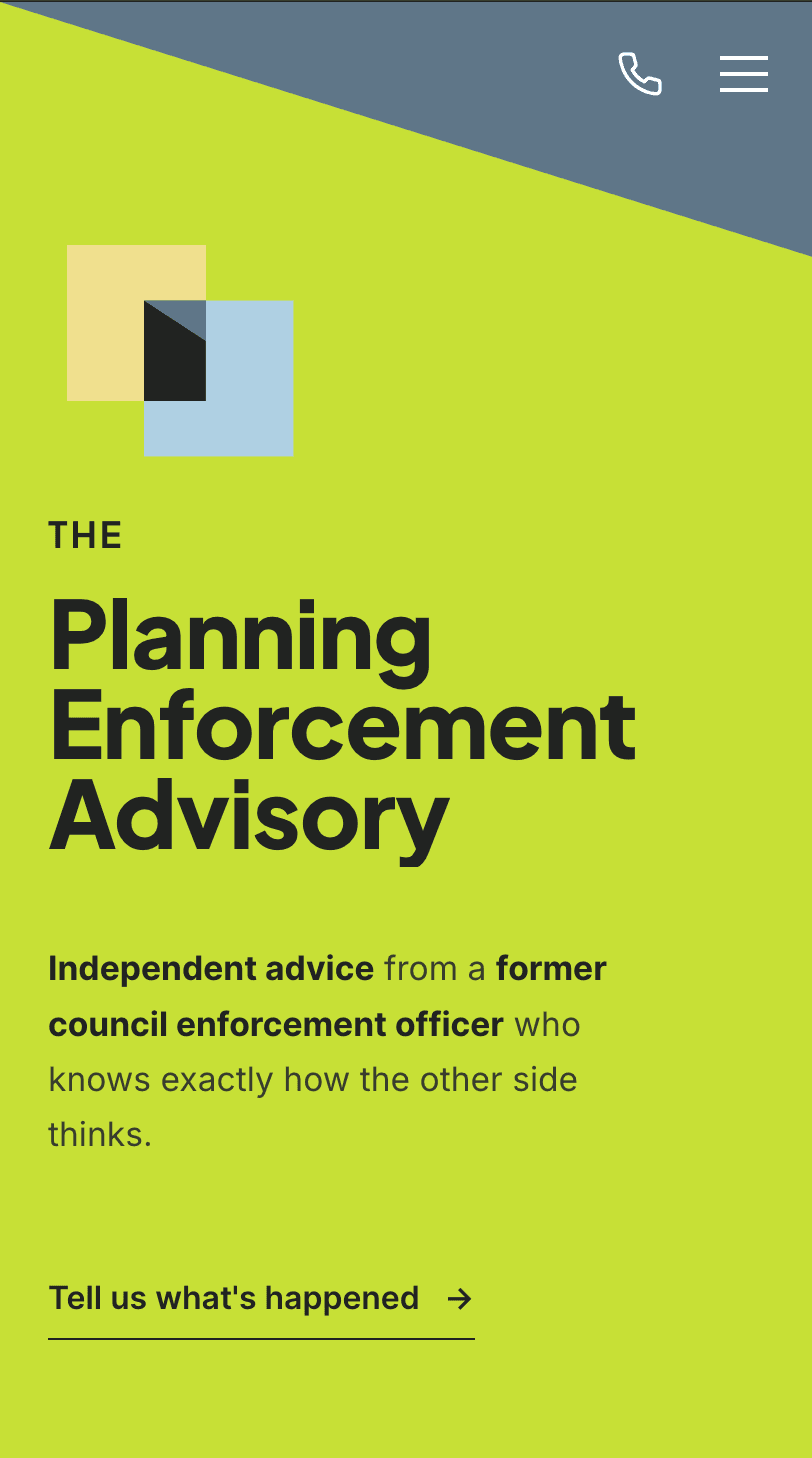
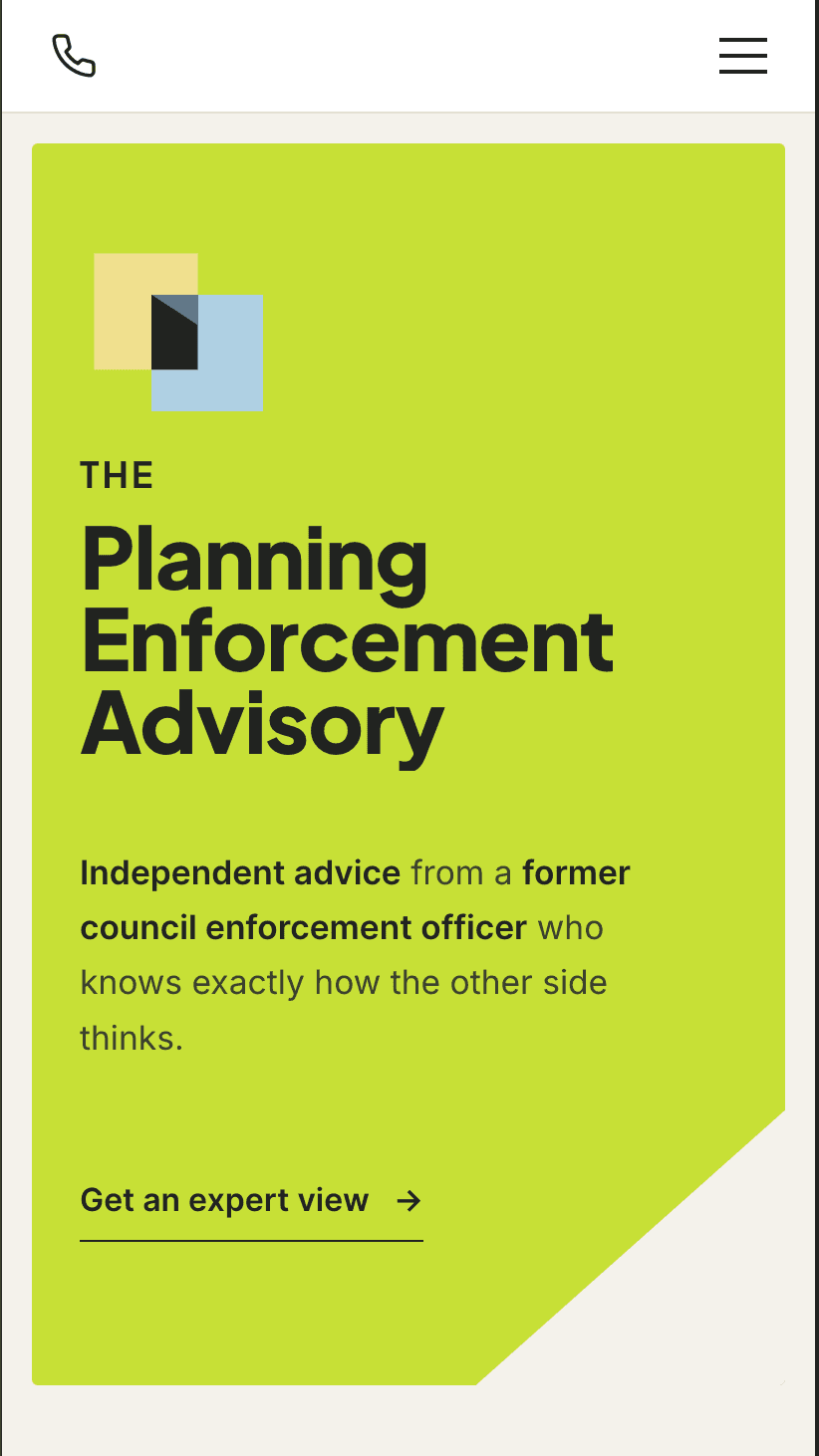
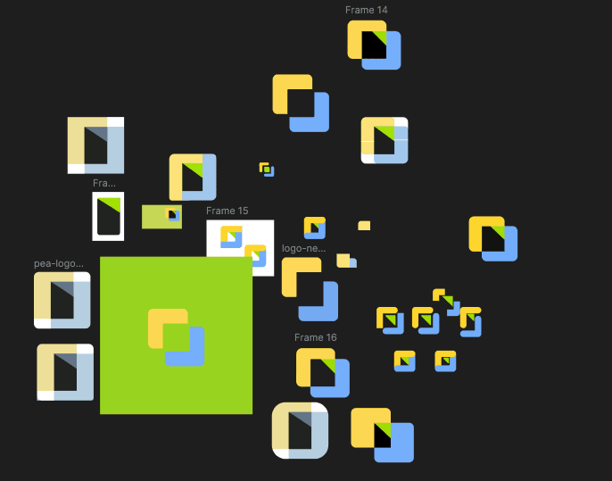
Alongside the interface, I tightened the mark through tests of proportion, negative space, colour and construction.
The finished system pairs bold typography with a restrained cream and charcoal foundation. Lime carries visibility, while blue and yellow act as supporting signals. The geometric mark stays precise and memorable without relying on obvious planning or legal imagery.
04
Build
This is what those decisions became.
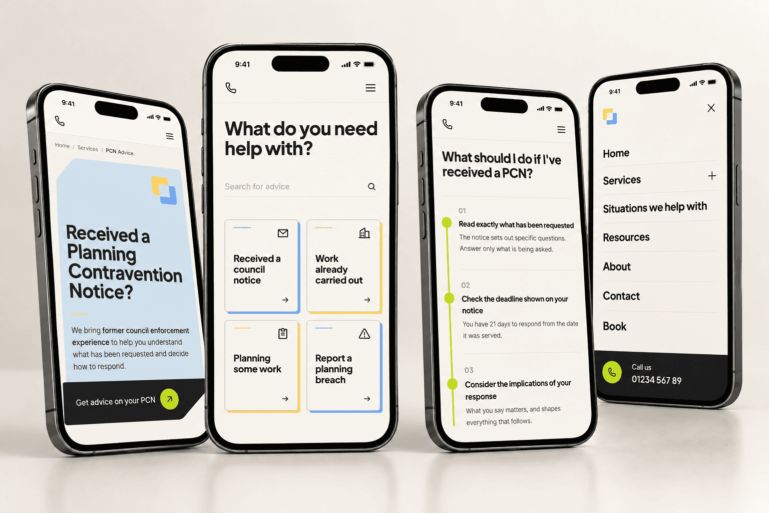
A mobile-first site with situation-led navigation, notice-specific service pages, plain-English explanations, clear deadline guidance, numbered next steps and a direct route to contact me. The founder’s council-side background is referenced throughout rather than tucked away on an About page.
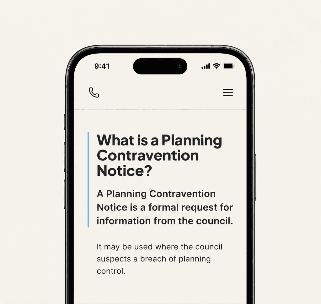
People said they wanted useful information before choosing help, so service pages answer the immediate question before pushing anyone towards contact. Professional processes are not always clearly explained, so complex processes are broken into plain English with numbered next steps.
Most people do not know which service they need.
People often recognise their situation before they know which service they need, so the site’s main routes start with a situation, not a service name.
- Received a council notice
- Work already carried out
- Planning some work
- Report a planning breach
- I’m not sure what I need
Urgency without alarm
Planning enforcement can involve genuine statutory deadlines, so the interface surfaces them directly instead of manufacturing urgency through conversion copy. The same 21-day PCN window from the research3 becomes practical guidance rather than a countdown timer.
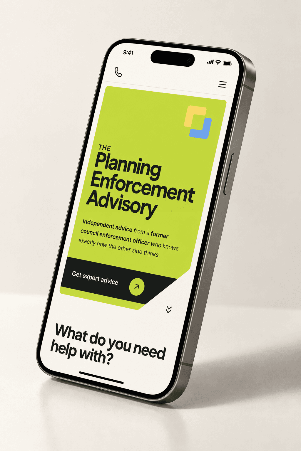
Designed from the smallest screen up
The core journeys were designed mobile first, with clear touch targets, readable guidance and direct routes to human contact. Desktop expands the system rather than defining it.
05
Evolve
Launch is the start of the next stage.
The business is new, so there are no invented success metrics here. The platform was built to evolve through real search behaviour, enquiry data, Search Console performance and genuine case studies as the consultancy grows.
- Search-led resource expansion
- Illustrative scenarios replaced by genuine client cases
- Conversion refinement from real behaviour
Built with Next.js and Sanity, deployed on Vercel, with Cal.com for bookings, Resend for email and reCAPTCHA for form protection. Google Analytics and Search Console configured ahead of launch.
Launching September 2026
Preview The Planning Enforcement AdvisoryAvailable for new projects.
Not sure on budget yet? See how projects are priced.